Portfolio / 6 - Web Design & User Interface / The Kompany Entertainment – corporate Website design
-
-
The Kompany Entertainment – corporate Website design
A film-noir-inspired corporate website for international Feature Film, Music Video and Commercial Production company “The Kompany”.
One of the challenges was to showcase a start-up production company, which had only a few portfolio items to show yet plenty of talent to offer.
The answer was to create a minimalist, film-noir inspired, old scool with a modern touch website.
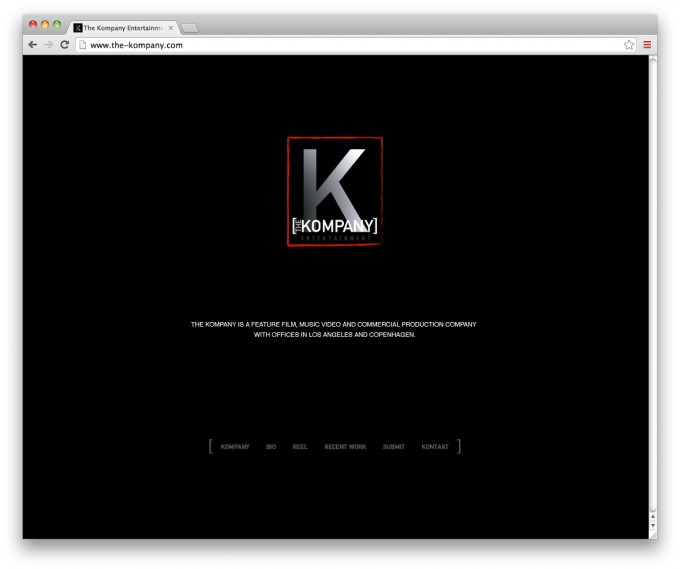
The home page simply displays:
– the logo,
– the mission statement,
– the menu at the bottom (in brackets, a graphic element borrowed from the logo).
Another playful graphic element is the use of the letter “K” which replaces the letter “C” in the menu item “Kontakt” as it does in the logo for “Kompany”.—
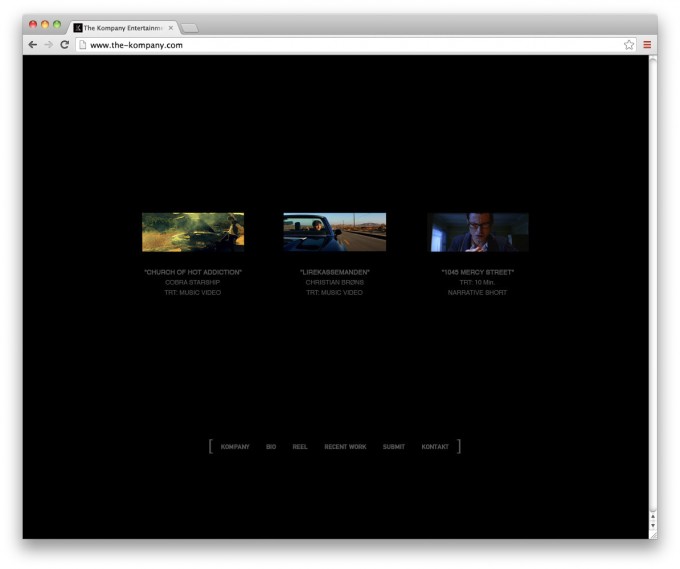
2) The RECENT WORK page displays 3 movies, with technical information and plenty of negative space…
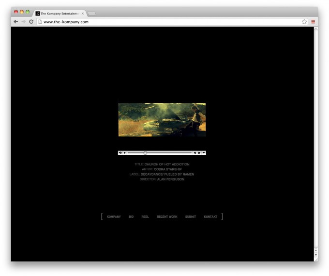
3) …the selected movie takes over the page.
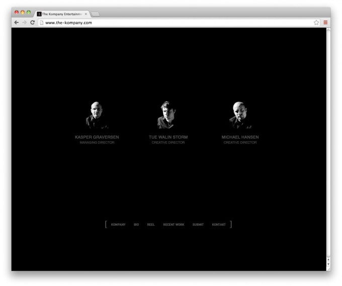
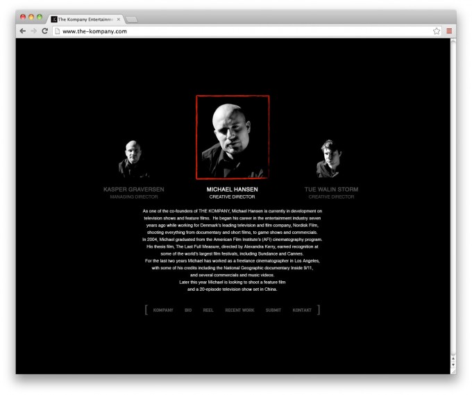
4) BIO page and presentation of the team….
5) …detailed biography of a selected team member.
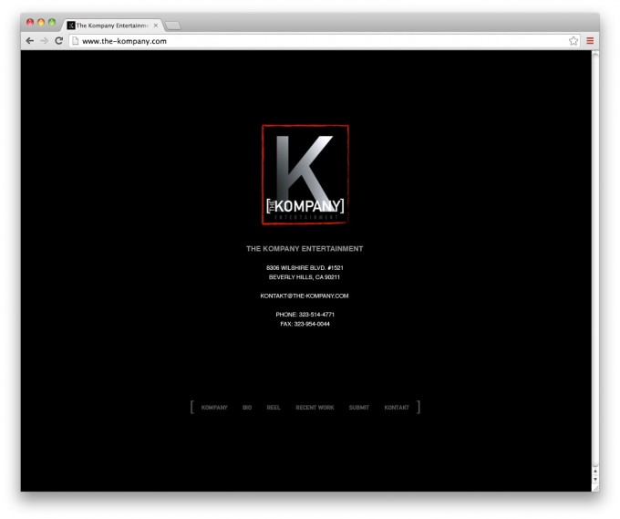
6) KONTAKT page.

