Art direction, Design, and Production: Mosaïque, the bilingual French-English Magazine published by the Alliance Française of Los Angeles and San Diego, California.
Edition 3: Paris and Versailles
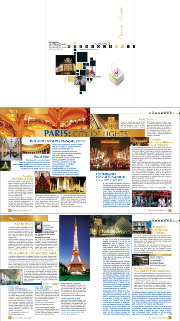
The New Year edition celebrated the glorious lights and monuments of Paris and Versailles. To honor French cultural heritage, I chose a golden color palette paired with a rich royal blue: evoking elegance, tradition, and a festive spirit.
The Brief
Starting with the third edition of Mosaïque, I was brought on to redesign the interior layout as a sophisticated, engaging, and easy-to-read format, while preserving the existing cover template.
Solution: a layout system
Working closely with the Los Angeles editorial team, I created a layout system that could be reused for future issues, yet remained flexible enough to be easily customized for each edition.
Production
The editorial team provided bilingual content (in French and English), photos, and advertisements. I handled the full design process: layout, photo optimization, presentation and revisions, and pre-press production. I conducted on-site press checks to review and sign off on final proofs (“Bon à Tirer” in French), ensuring the highest print quality before full production. I also produced downloadable web versions for online distribution.
Result: Expansion
As the new design led to more visibility and popularity, the Los Angeles-based publication expanded to include a San Diego edition.
I managed the design and production of both versions. While some content was shared, each edition also included location-specific pages, adding complexity to the design, pre-press, and printing process. To maximize the production budget, I proposed an optimized workflow: shared pages would be printed in a single run, while location-specific content would be printed separately and assembled into their respective editions. This approach influenced the editorial structure, as location-specific content had to be confined to dedicated pages, but it proved to be a cost-effective solution and was successfully adopted.
Each version also had their respective online formats, which I would also produce and deliver as web-optimized PDF files.
Edition 4: Lyon
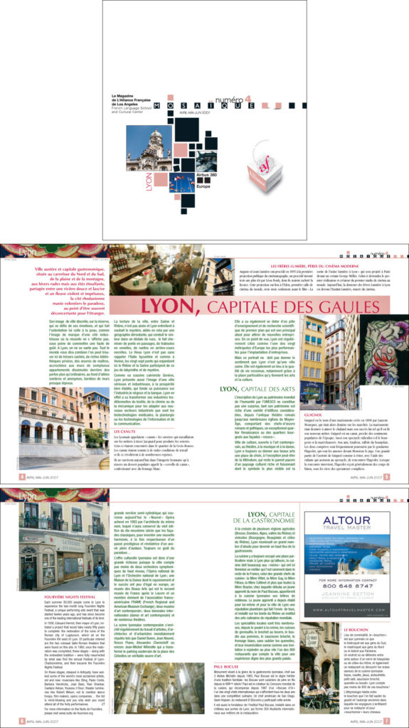
The old town of Lyon is famous for its pink colored renaissance apartment buildings with pastel tones, therefore it was an obvious choice to use shades of pink and fuchsia as the main color tone for this edition.
Edition 5: Polynésie Française
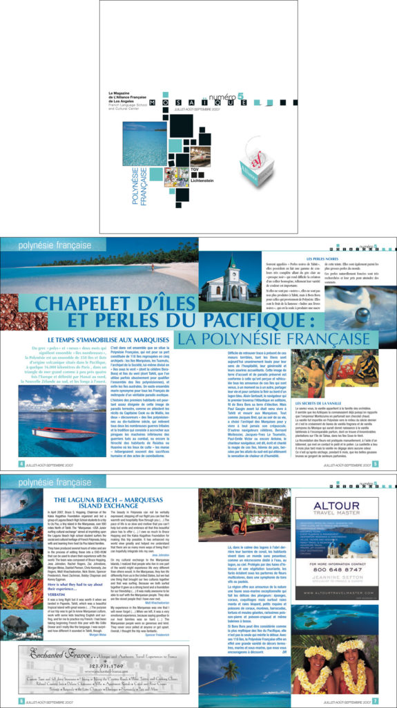
Dark and coral blue on white pages make this edition truly feel like a trip to the tropical pacific islands!
Edition 6: Strasbourg
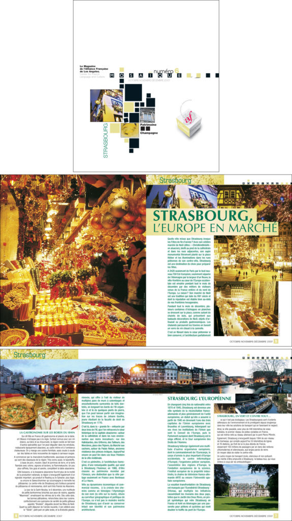
A dark green and a textured light gold was the color theme for this edition that acted as an invitation to celebrate the end of year festivities with lots of champagne, in pure French tradition!
Edition 7: Québec
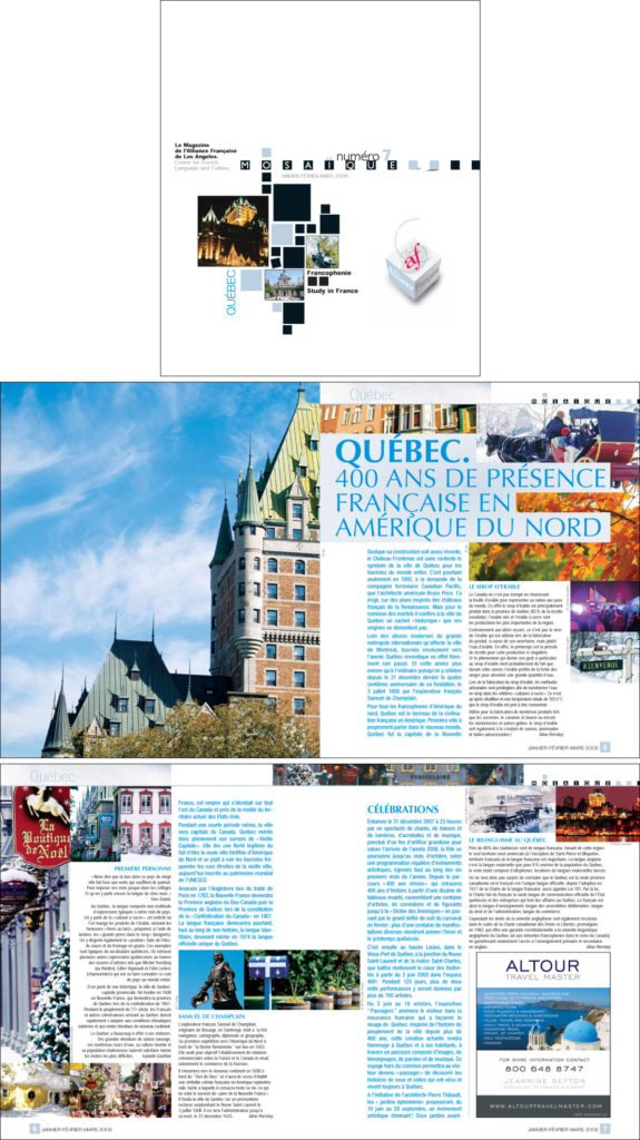
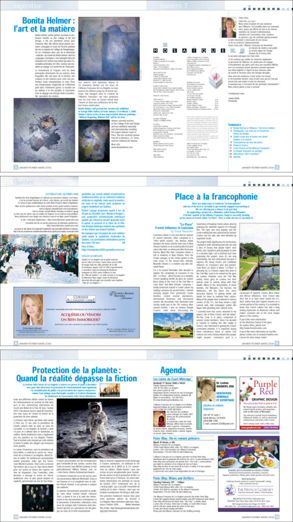
Ice cold color for a frozen visit to Québec.
Edition 8: Bourgogne
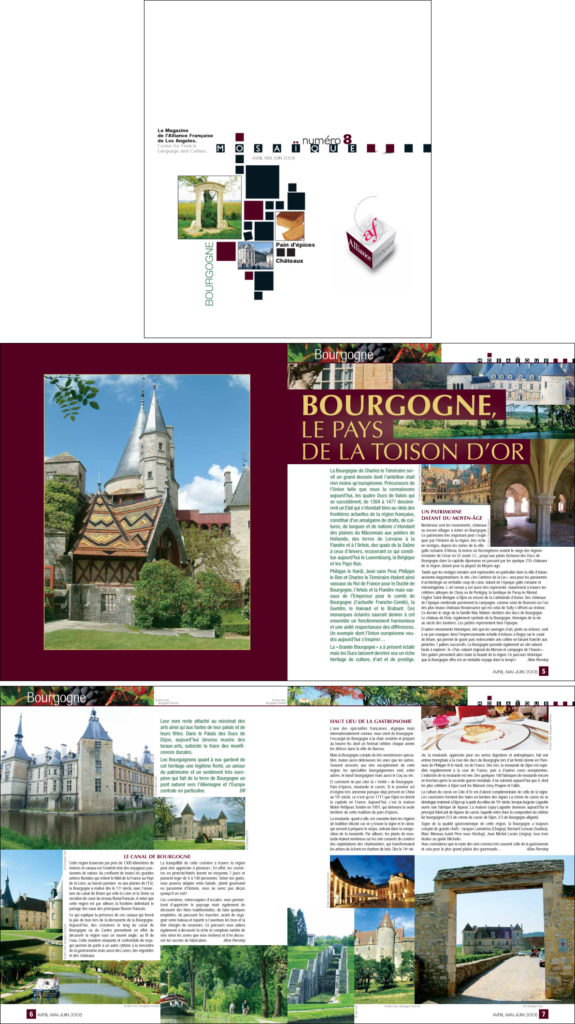
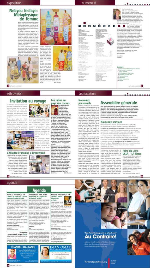
Burgundy paired with lush dark green for an escape to Bourgogne, exploring its castles and gourmet dining.