How imagining a minimalist design tool led to building an award-winning SaaS graphic design application.
Software creation, SaaS, Product Design, UX/UI, Lean startup, Business model
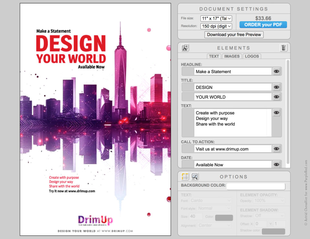
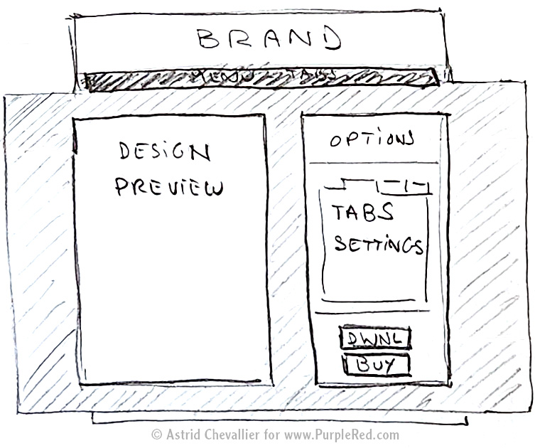
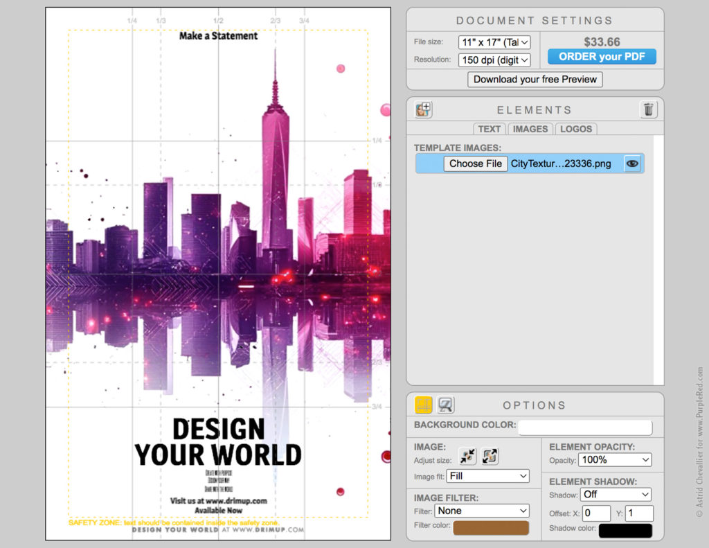
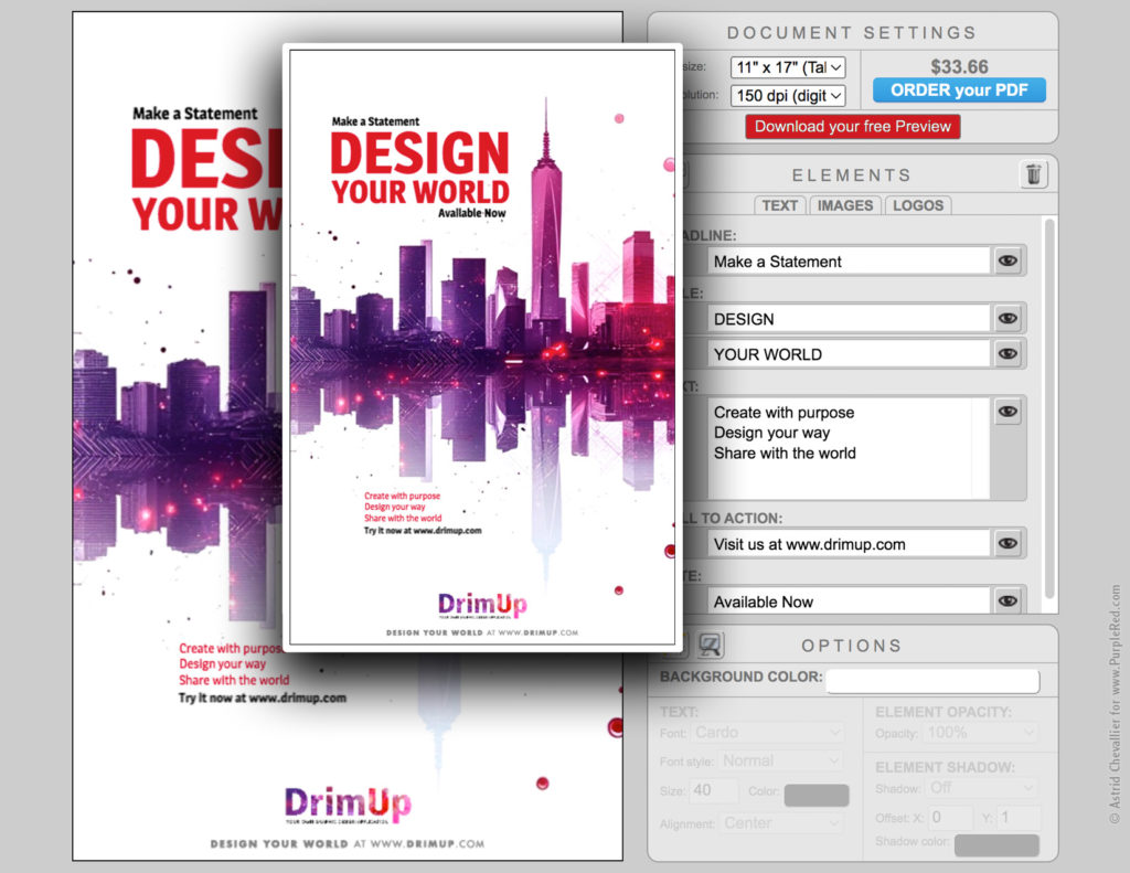
The graphic design application: preview on the left, elements on the right
The Challenge
How about a user-friendly design application that allows people and businesses to design professional-looking one-page layouts, without having to hire a designer or committing to expensive subscriptions?
Existing platforms are either too complex and overwhelming, too generic and unprofessional, and/or too costly for occasional use. With users looking for cost-effective design solutions yet aim for professional quality, there is a space for an application that offers optimized high-quality design with a different business model.
The Solution: a simple and flexible SaaS graphic design application
DrimUp was built with one goal in mind: simplicity.
The application enables anyone, regardless of design experience, to create beautiful, well-structured one-page visuals within minutes. From layout to user flow, everything is optimized for clarity and intuitive interaction.
Positioned between products from Canva and Adobe, DrimUp offers a streamlined alternative that’s more focused, more affordable, and tailored to real-world users who seek both efficiency and quality without the commitment of subscriptions.
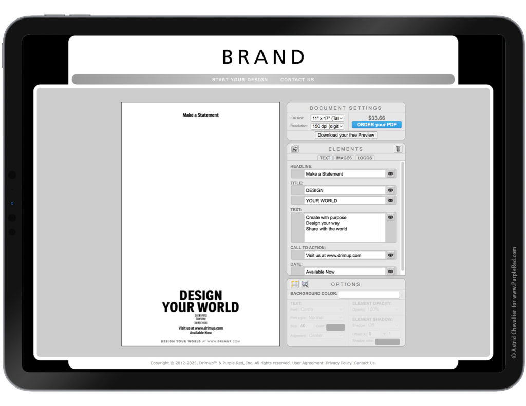
Simplicity: a zen, minimalist environment focused on the essentials
Building the application
It took a couple of prototypes and the help of several developers (and later on AI) to build a working application that would deliver what I had in mind.
1. Interface Concept
As the Creative Lead, I designed the look and feel, and used HTML and CSS to build the User Interface of the software, and the overall website.
With simplicity as the guiding concept, I established fundamental guidelines:
• no distractions (no ads, no funky colors, no magic moving gimmicks)
• a dedicated space (the Design Center) with a clean neutral grey background
• a minimalist interface displaying the most commonly used elements, with the option to add more text fields, more images, and more logos if needed.
2. Icons
Icons are visual solutions that express key concepts and functions.
In an intuitive interface, their meaning is immediately clear and their placement guides the user naturally toward the right actions.
The best icons are often “invisible”: we don’t stop to analyze them or remember their shape; rather, they simply work, like secret agents of usability. That invisibility relies on design consistency, where every element feels balanced and in harmony with the rest of the interface ecosystem.
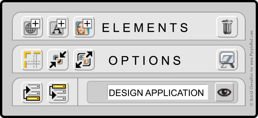
Interface Design: buttons and icons are subtle visual cues that guide users seamlessly through an intuitive interface.
3. Buttons
Buttons are equally discreet.
To work effortlessly, they must respond clearly at every stage of interaction: on, hover, down, and off. Each state must be carefully designed to support smooth interactivity. Buttons trigger changes and provide immediate visual feedback that confirms the user’s actions.
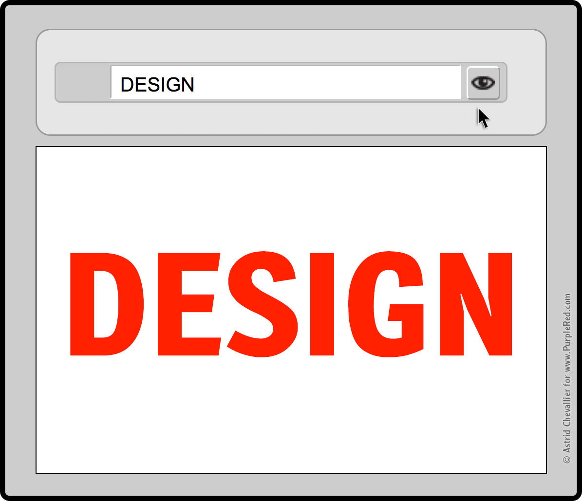
Clicking the “eye” icon on the button toggles the visibility of the text layer that displays the word Design: showing or hiding it.
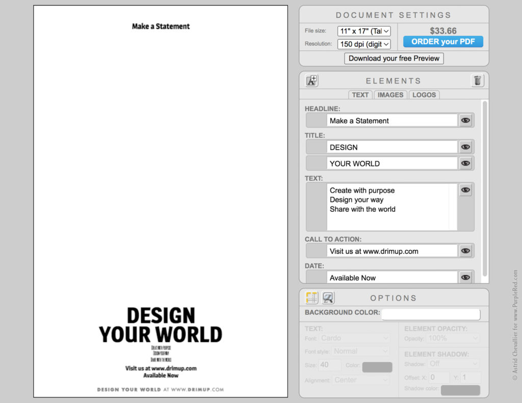
4. Palettes: Simplicity through Optimized organization
Three palettes offer full customization of the design.
No overwhelming menus, no hidden items. Just focused, organized, intuitive control.
…..
1) Settings:
Core document settings:
• Size (which determines the purchase price)
• Resolution
• Free low-res preview download (perfect for social media)
• Purchase option for a high-res file (for printing or larger use)
…..
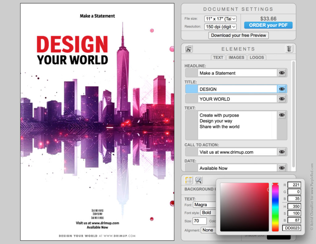
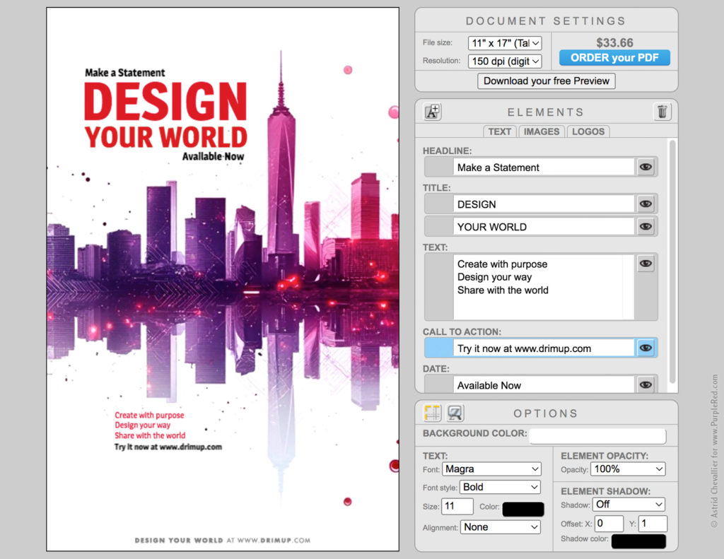
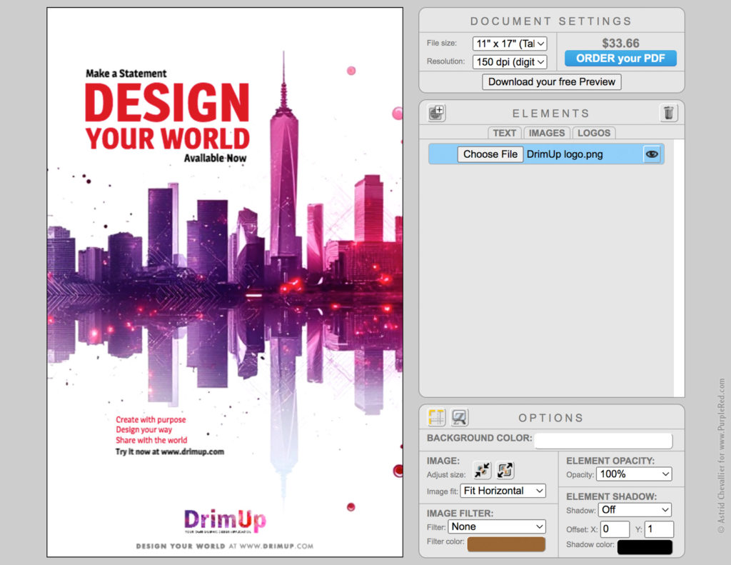
2) Elements:
The second palette gathers the building blocks of the design, with options to add or discard elements as layers. They are organized into tabs:
• Text
• Images
• Logos
…..
3) Options:
The Options palette and provides context-specific adjustments adapts to the selected element type (text or image):
• Background color of the page
• For text: font, style, size, color, and placement.
• For images: size, placement, and filter.
• For all elements: opacity, and drop shadow

The Option palette adapts when switching between text and images: changing only what’s relevant while keeping everything else consistent. Simplicity and minimalism imply altering as much as necessary, yet as little as possible.
5. Integration
As the Founder, I had a clear vision for the software I wanted to create: a simple, intuitive, and versatile application. Backed by years of professional experience with industry-standard graphic design tools, I translated my vision into concrete features and user flows to guide the development team.
I worked closely with developers to implement core functionalities, always keeping the user in mind. Along the way, we had to make many key decisions, including:
• which fonts to use and how to ensure they preloaded correctly
• what payment system to adopt (we tested a few)
• how to manage data storage
• how to optimize the rendering flow
• how to deliver the final product
• how to provide the best possible customer support
• how to prevent or fix common user mistakes
Many of these challenges were solved through a combination of technical solutions, soft skills, and clear communication.
We refined the tool through early testing and beta-testers feedback before launching the first version. Real-world usage and ongoing customer relationships provided additional valuable insights, which led to fine-tuning the product and relaunching with improved clarity, consistency, and usability.
The original concept: rooted in simplicity!
The result: a simple, clear, and easy-to-use graphic design application accessible on any device.
The flow: UX
Here’s a typical User Experience flow.
1. Design Center
An “almost blank” page welcomes the user.
It is clean, minimalist, and distraction-free, yet it includes a few commonly used elements to prevent “writer’s block” or blank-page paralysis. These existing elements invite the user to take immediate action and start editing.
Start with an “almost blank” page
2. Image
An image can be uploaded right away to get the project started.
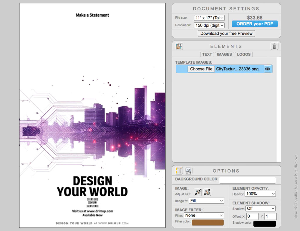
Upload an image: Elements Palette > Images Tab > Choose File
3. Position
The image can be moved. A grid is available to help position the elements on the page. Here, the tall tower is aligned on the right third of the page: a classic rule in layout design.
Use the grid to position elements
4. Title
Type your text in the Elements Palette and choose its options such as font, size, color and alignment. Once selected, the text can be moved directly within the design.
Type and position the title
5. Text
Type and position additional text as needed.
Elements can be hidden, removed, or added: there’s no constraint from the default content.
Type and position the rest of the text
6. Logo
Upload and position a logo. And voilà!
Upload a logo: Elements Palette > Logos Tab > Choose File
7. Free Preview
Download a Free Preview: perfect for posting on social media.
Free Preview
8. Order your PDF
Order you PDF: your design is going to be rendered, and a download link for your high-qualifty PDF file will be sent to your email.
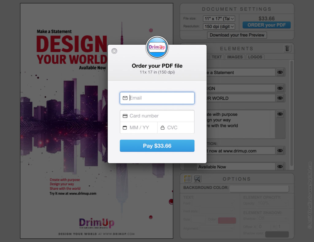
Order your PDF
8. High-Quality PDF
Your design is now available as a high-quality PDF you can print anytime, anywhere.
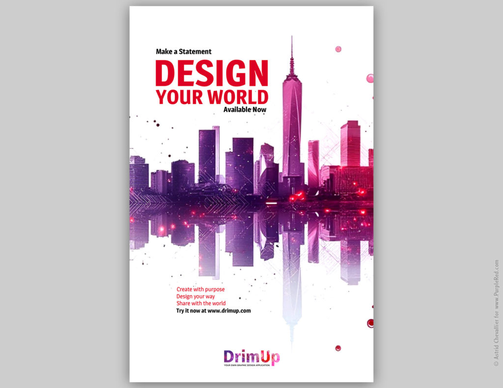
High-quality PDF file
A flexible business model
For individuals and occasional users:
• Freemium access to design tools, with free low-res downloads: ideal for social sharing.
• Pay-as-you-go purchases of high-resolution, print-ready PDF files: no subscription required.
For businesses and organizations:
• Custom-designed templates (with a setup fee) for repeated use, integrated with the freemium and pay-as-you-go model: perfect for small businesses whose teams or clients need branded design on demand.
• White-labeled and licensed as a fully branded design platform: ideal for niche markets looking to offer their own design solution.
Result
I envisioned and built a graphic design application that allows anyone to create one-page visuals. Designed for simplicity and real-world usability, it empowers individuals and small teams to design professional-quality material without expensive subscriptions. From concept to execution, the software reflects thoughtful design choices, strategic development, and user-driven refinement.
The application features a clean, minimalist interface; clear, responsive buttons and icons; and an organized palette system that supports efficient creative workflows.
Its flexible business model includes freemium access with optional high-res PDF purchases, and white-labeled solutions for businesses seeking customizable design solutions. It bridges the gap between generic DIY platforms and overly complex professional tools by offering an elegant, cost-effective solution for anyone who needs good design made simple.
It has won several awards for its design and user experience.
Try it live at www.DrimUp.com
