Logo for Launch, a startup accelerator
The Brief
Launch needs a logo that represents the high growth potential of the companies they work with.
Background: Launch is a consulting firm specializing in helping sustainable startups raise funds and develop their business model. Launch helps startups grow by developing their business structures, raising capital, increasing sales, scaling operations such as product development and manufacturing, and developing marketing.
Target audience: CEOs of tech startups looking to expand their potential, build a customer base, increase visibility, and find more investors in order to build a successful company.
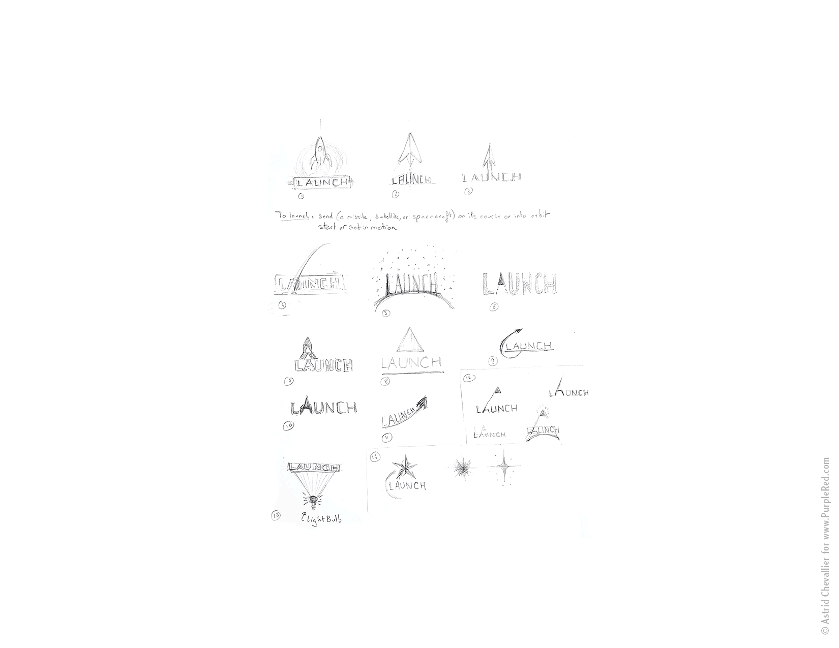
1. Research & 1st Concepts
Research often starts with extracting the most obvious idea (the rocket), and let a concept emerge from it in a more abstract manner.
Sketching is an essential part of conceptual thinking, as it allows to quickly explore ideas and put them on the table.
The process usually takes a few days, as ideas grow from one another. It’s important to be non-judgmental at first, because some ideas come later or from a combination of early thoughts and newest explorations.
Then it’s time to take an analytical look. Here there’s a pattern that emerges which involves “elevation”.
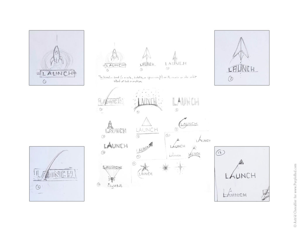
A selection of concepts are developed further
Four concepts are selected, and processed through an AI renderer for a quick black and white graphic expression. The results are both rich and messy, which allows the concepts to emerge in another form!
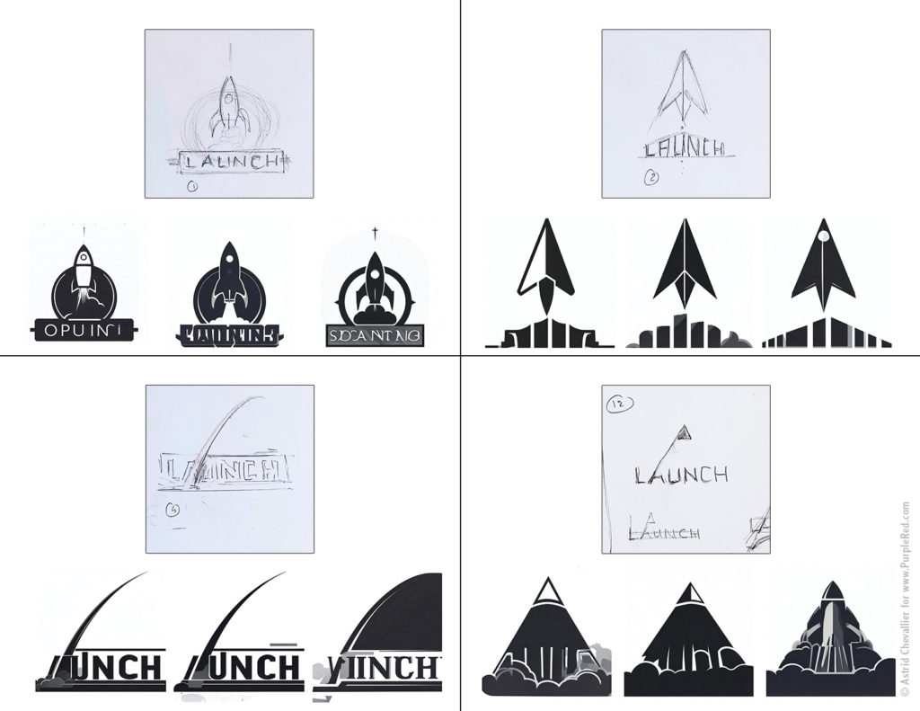
The art of logo design is to simplify
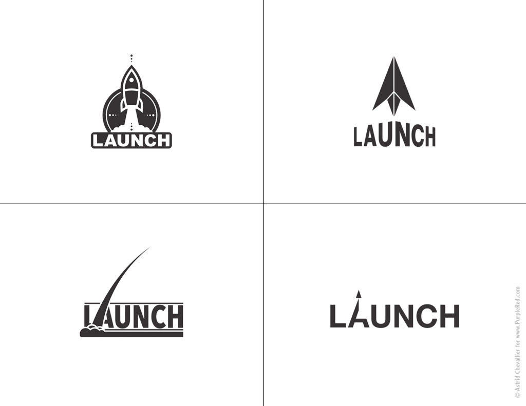
The next stage is to take the four ideas and turn them into actual logos.
That involves simplifying and manually tracing the visuals as vectors in Illustrator and making Typographic choices. Symmetry and balance are key. The work is done in black and white for purity of form.
The four logos are now ready for the first presentation
First Presentation
2. Development of one Option
Out of the first four options, one logo is selected for further research and development.
While all options conveyed the idea of launching, the selected option also suggests a transformation from the letter A into a triangle.
This stage is about refining that idea and make it more iconic.
It can take again many iterations before finding a minimalist and efficient solution.
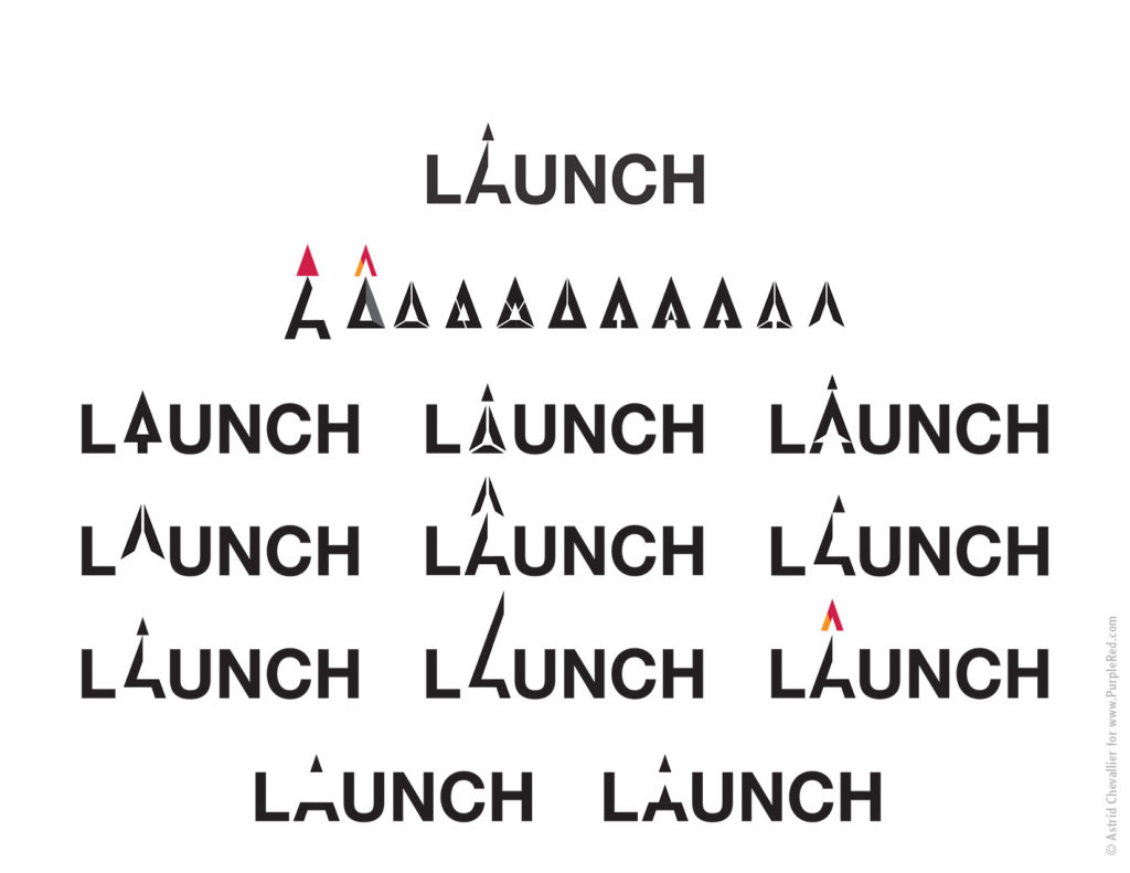
Incorporating color is tempting at this stage, and sometimes it helps by bringing a bit of new energy, but ultimately a good logo will work in black and white and at a small scale. Three options are selected from these explorations. Usually this is a very collaborative stage, since feedback can really help fine-tune the next steps.
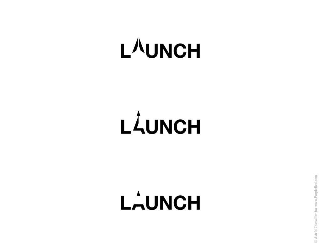
Three new versions of the logo are ready for Presentation and Feedback
Second Presentation
3. Final Adjustments
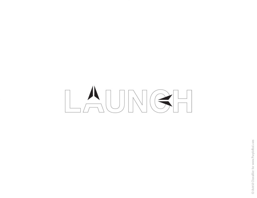
Feedback and further simplification led to the final design of the iconic logo mark.
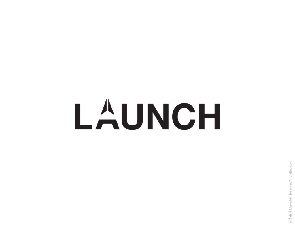
The typography is also adjusted. Here, the letter C is being opened more by using the logo mark triangle. This creates more unity overall. It also creates a subtle more uniqueness, which is essential for a brand to differentiate itself from everyone else.
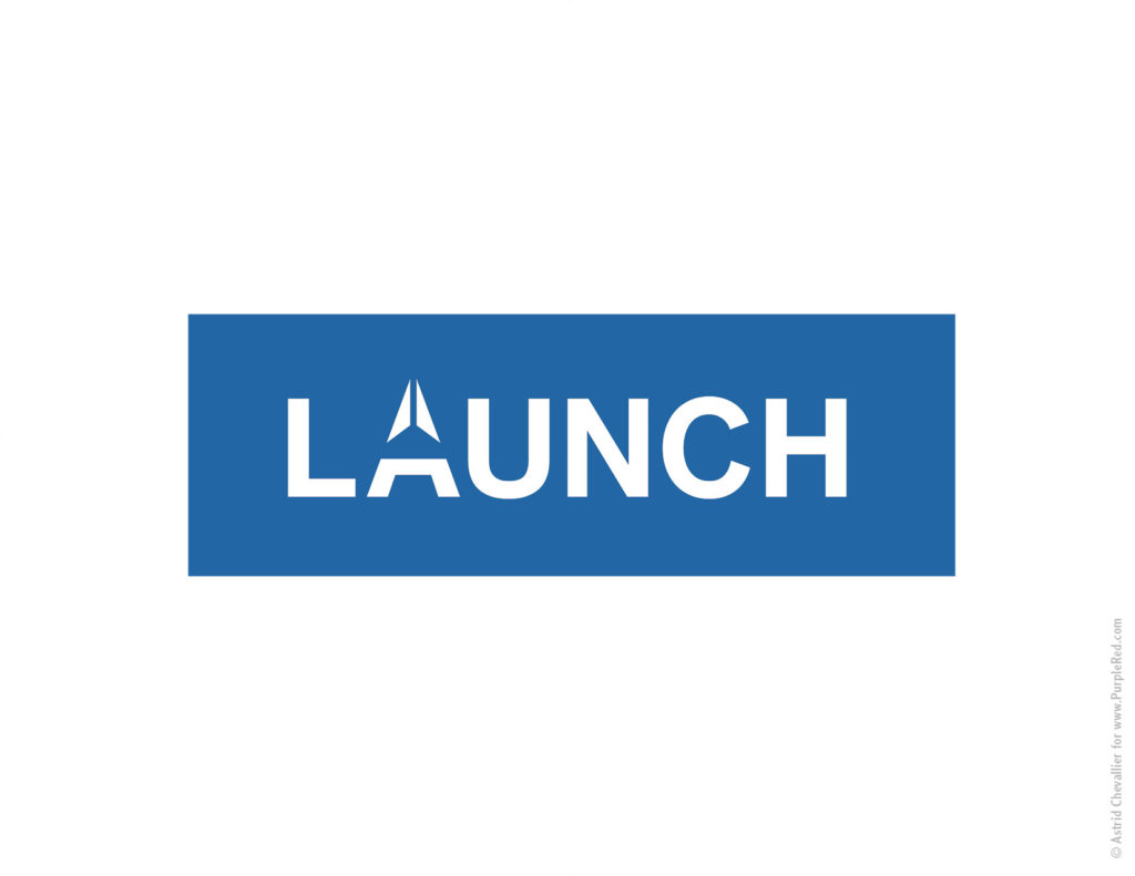
Finally color can be explored.
A dark blue is the main color.
The colors for the logo mark ended being a green (representing the earth and the sustainability aspect of the market) and a lighter blue (for the sky, and elevation). The value of the two colors of the logo mark have so stay close to the value of the dark blue of the typography, so that our eyes can make the connection and recreate the letter A subconsciously.
The Launch logo is ready to be launched!
Final Logo