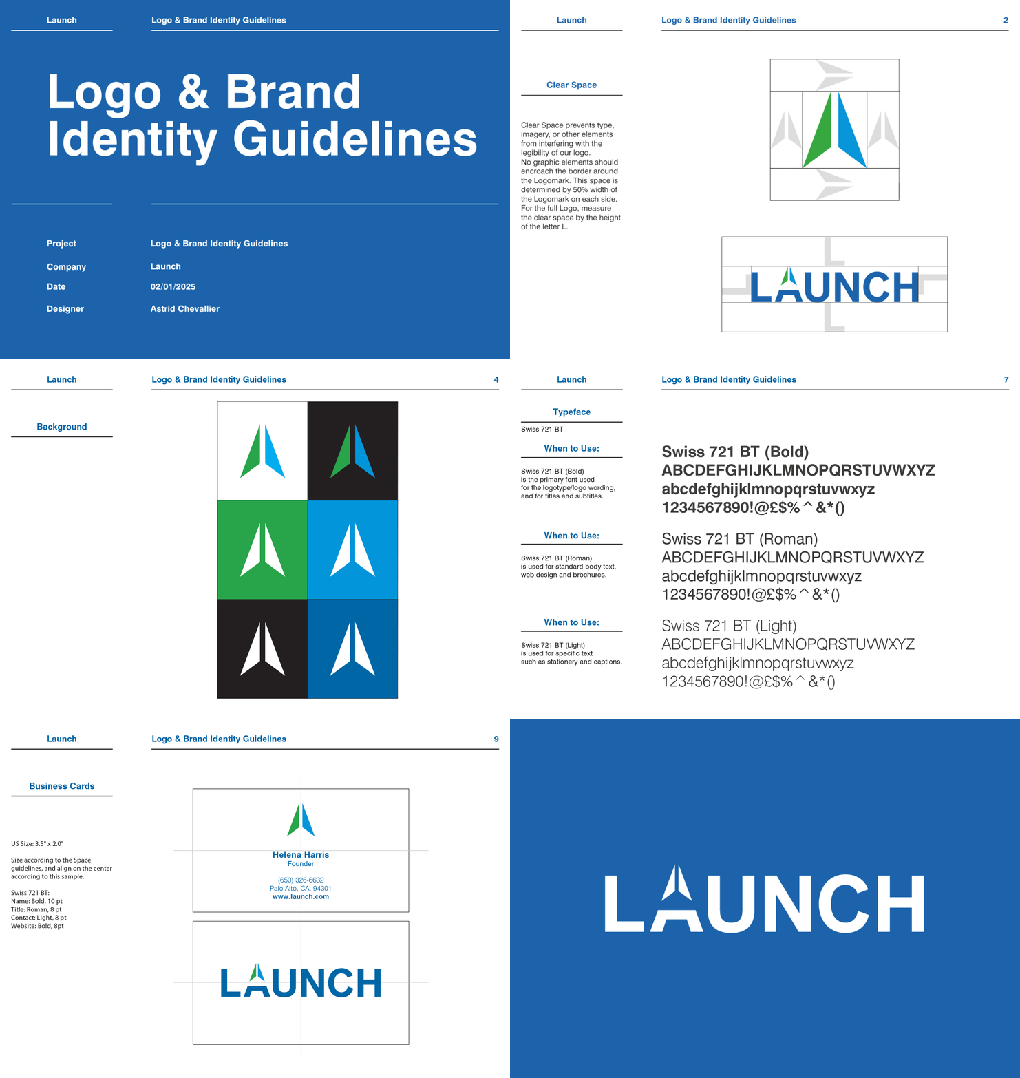
Building consistency and clarity into Launch’s visual system.
Bypography, Color, Branding, Design, Visual Identity, Brand Guidelines
Guidelines for visual consistency
The Brief
With the release of the logo, Launch needed a practical system to ensure brand consistency across all communication materials.
Solution: Guidelines
I created a set of brand identity guidelines that provide clear direction on typography, color palette, spacing, and usage across a variety of backgrounds, to ensure brand consistency as Launch scales.
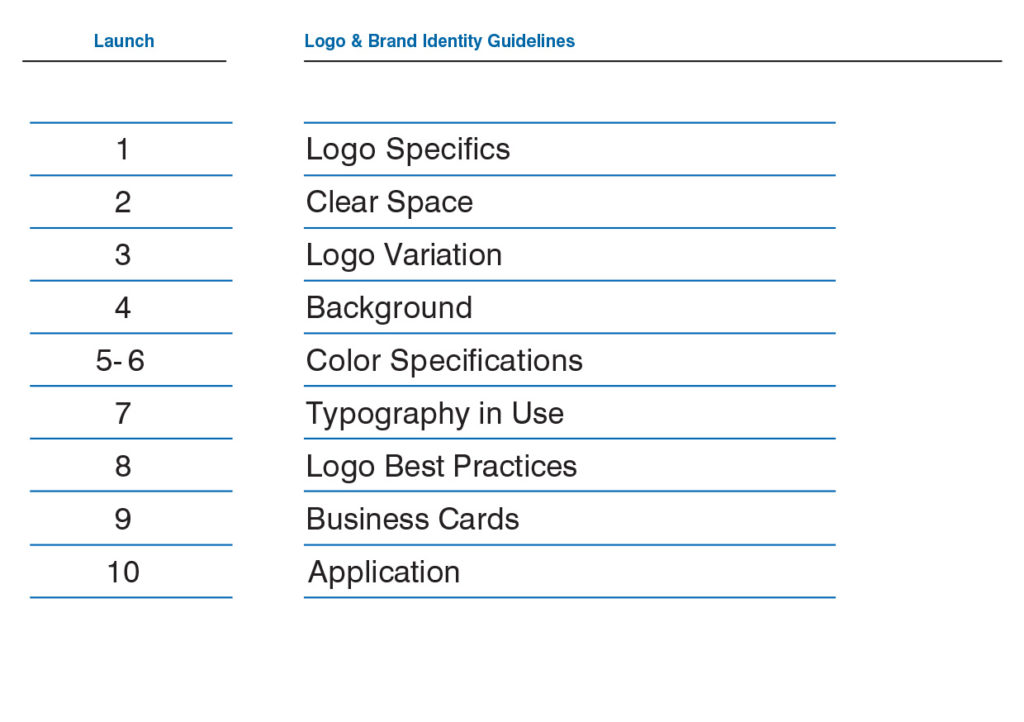
The topics cover fundamental concept to practical applications
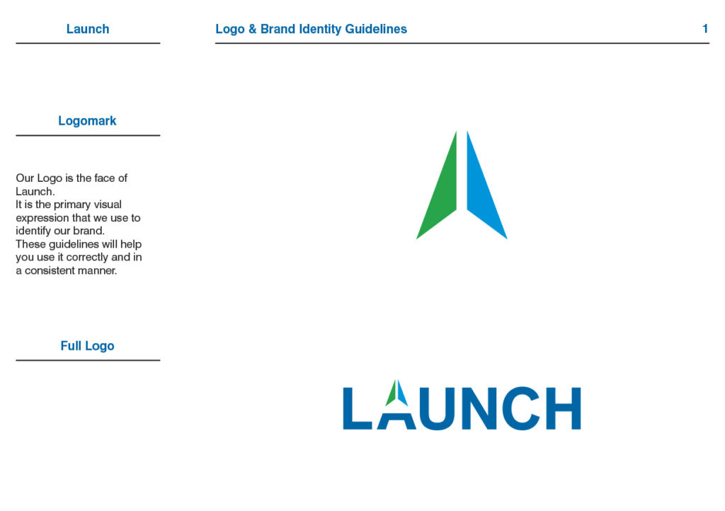
The logo and logomark
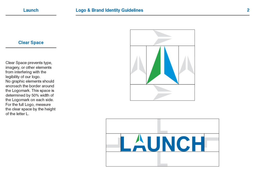
The minimum space around the logo and logo mark
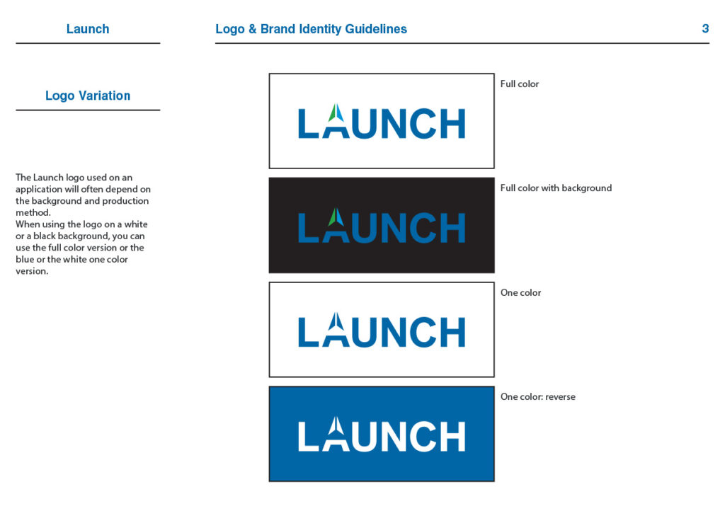
The full color logo, the one color (blue), and the white logo
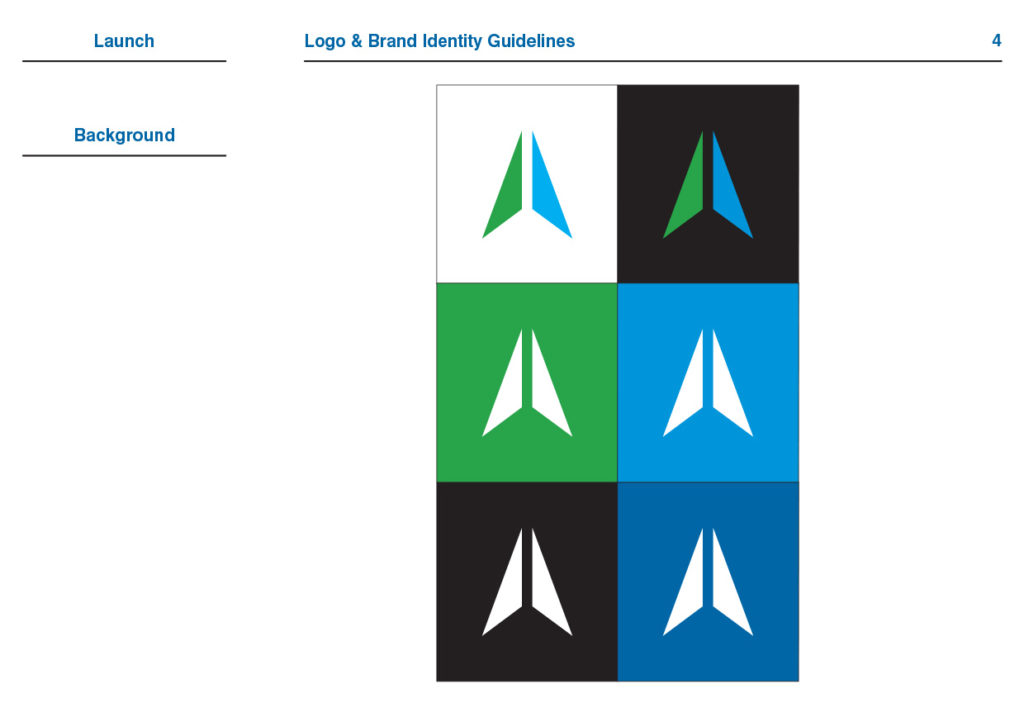
Best options for different backgrounds
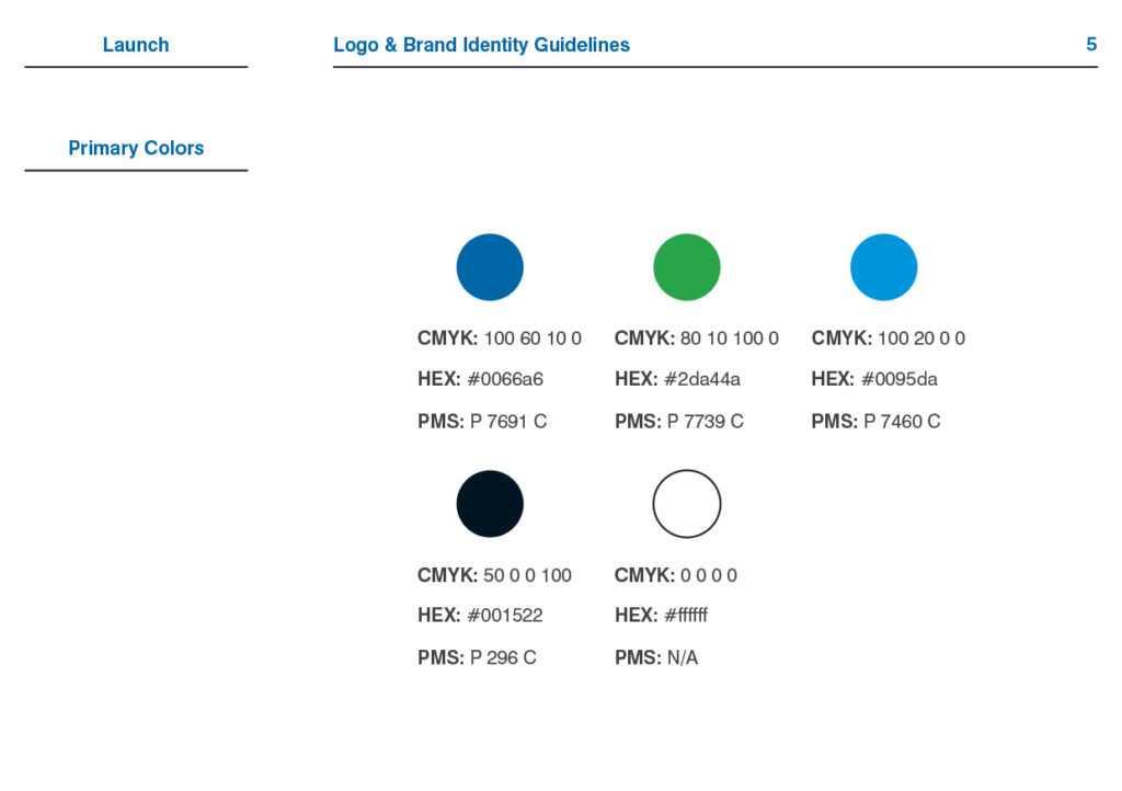
The primary colors: used by the logo + black and white
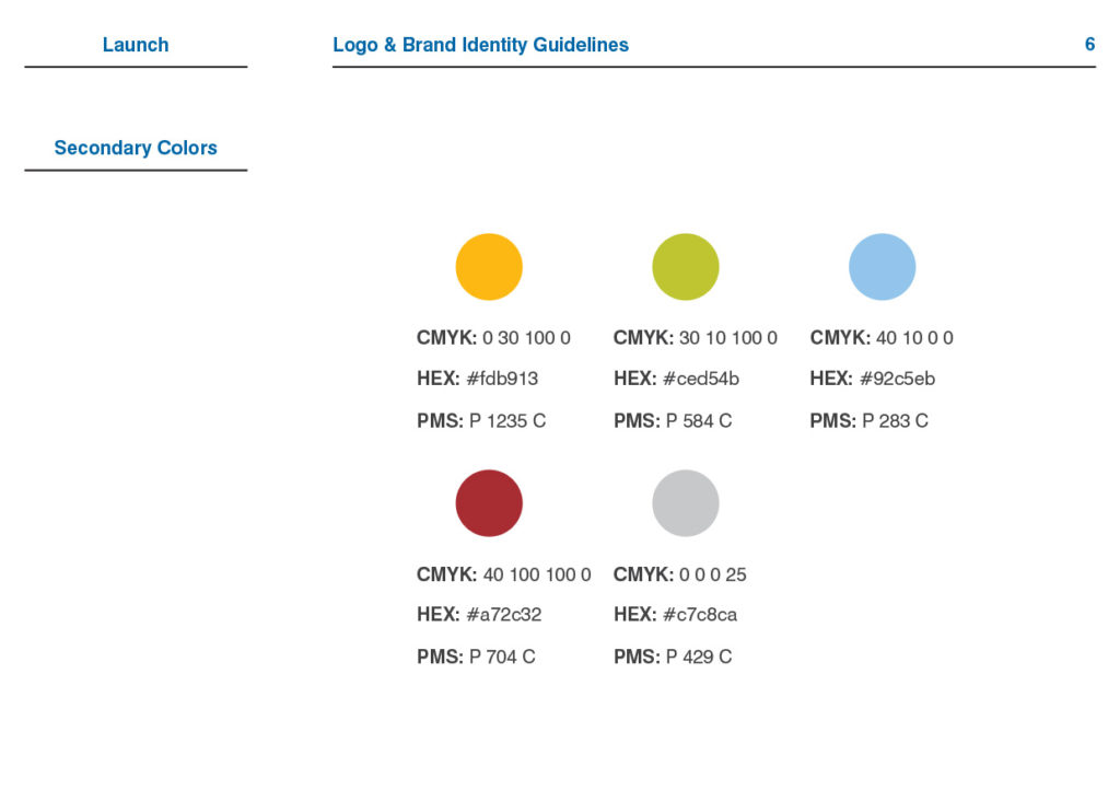
The secondary colors: can be used to create backgrounds, titles, or other graphic elements
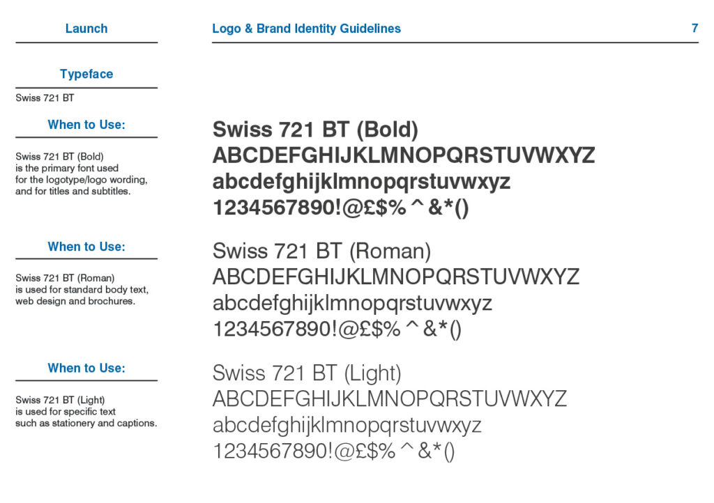
The primary typeface and how to use it
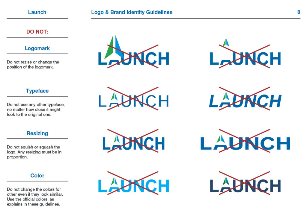
What NOT to do
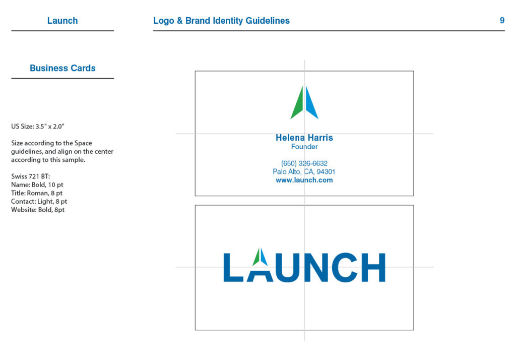
Business card application exemple
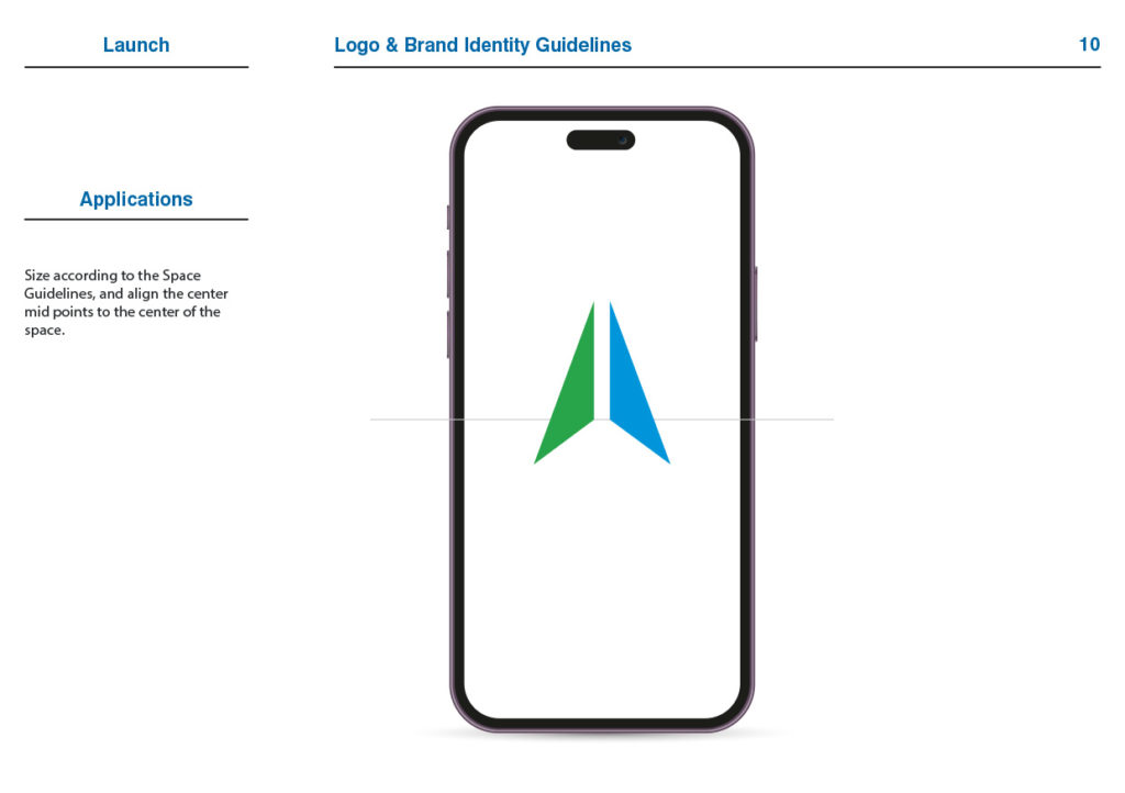
Digital app exemple
Full color

White on blue
Result
These Logo and Brand Identity Guidelines lay the foundation for a strong, unified branding communication system. With clear, practical direction, the team can apply the branding consistently and confidently, ensuring clarity, recognition, and cohesion.
